Branding & UI
SAVE POINT
A Bar that Gives A Fresh Look to Gaming Nostalgia
➜ OVERVIEW
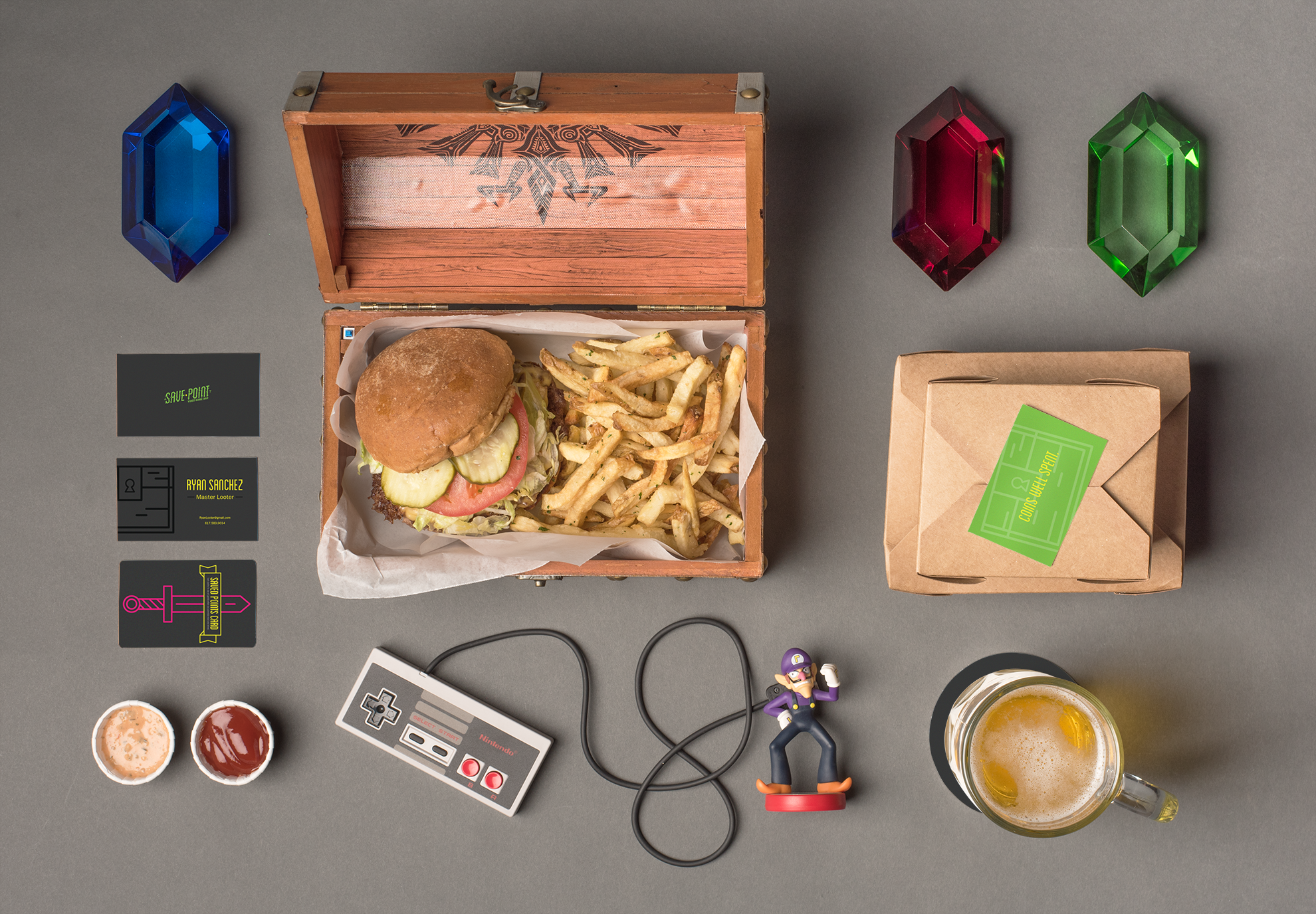
Save Point is a new restaurant and bar that is centered around video game culture. The establishment seeks to bring together those who enjoy gaming and drinking to indulge in nostalgia and conversation.
The restaurant targets a younger audience who enjoy the social aspect of gaming. Save Point’s brand seeks to give a fresh look to gaming nostalgia by straying away from the cliche 8-bit pixel look.
➜ APPROACH
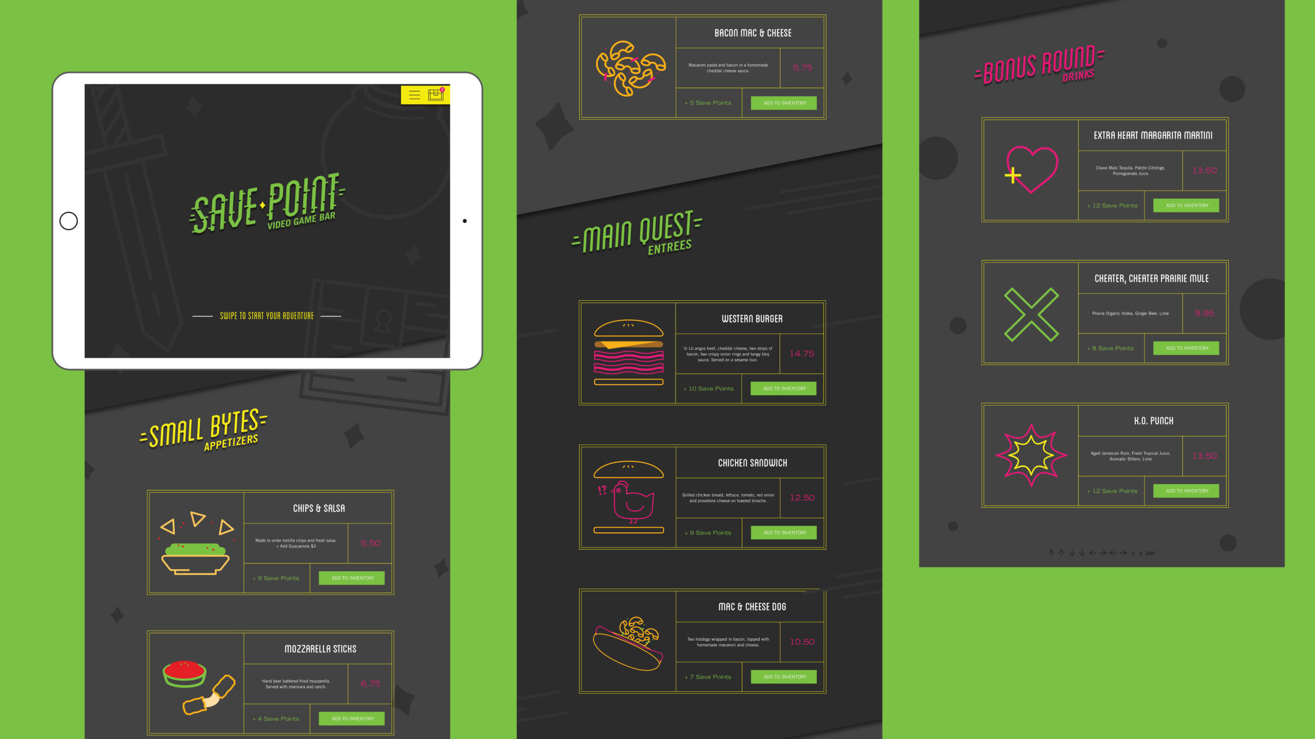
Geometric line work illustration and bright colors pop against a background of dark grays. Blanch, a geometric typeface with a tall x-height, is used as the primary font for its connection to the illustration style.
The logo is inspired by glitched elements and saving checkpoints, a reference to role playing games. The interactive digital menu has a fun UI that connects the ordering process to gaming.